Redesigning the
Sky Go app
About
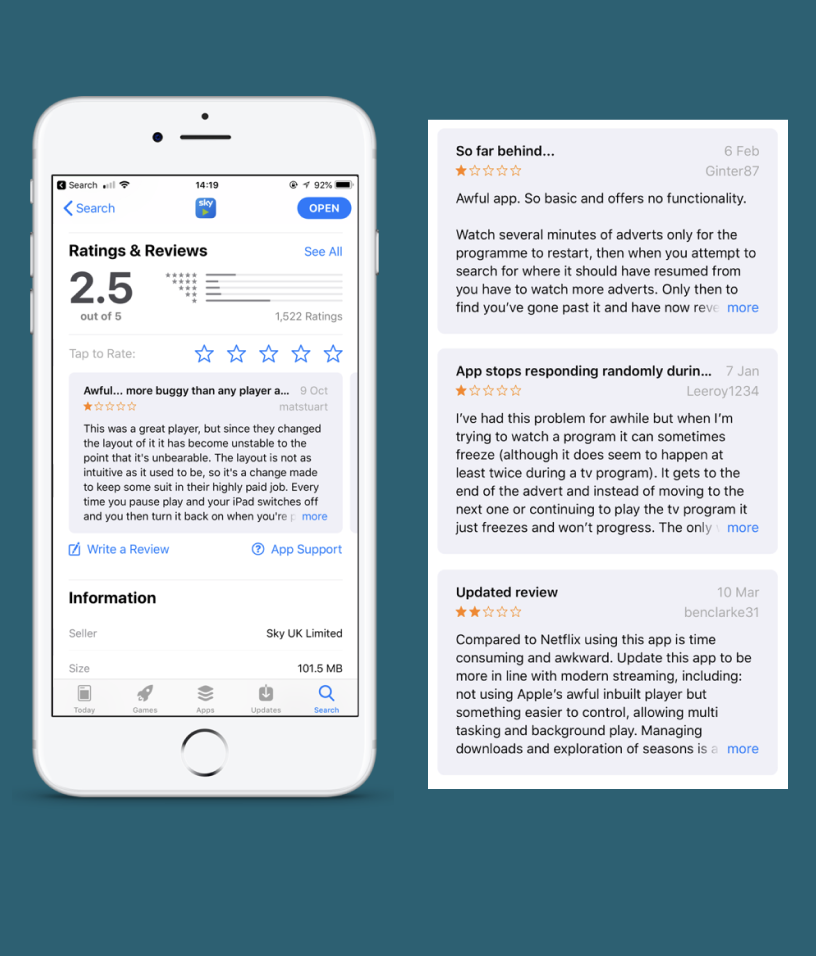
Sky has 23 apps with 5 of them focusing on watching content. Sky Go and Q apps currently perform badly in the app store with only one star ratings.
How can we merge apps and improve NPS?
Year · 2019
Job Title · Designer
Company · Sky
Year · 2019 Job Title · Designer Company · Sky
The Challenge
The Sky Go app is rated 2.5/5. Users find it basic, time-consuming, crashes often, and buggy.
“30% of all actions
on the phone are
planning”
“60% of viewing
is in GO”
— Sky Go Data
Design process
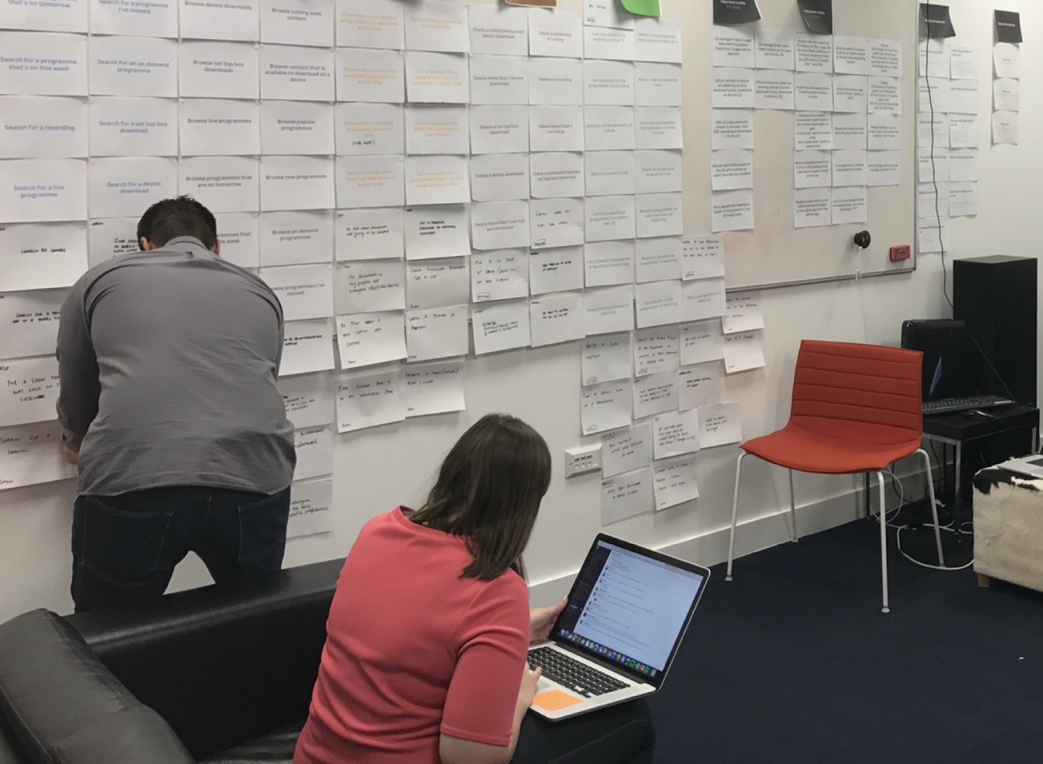
User Story Mapping
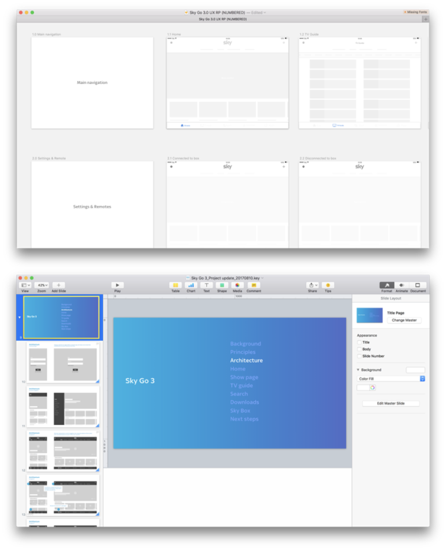
Defining architecture
Communicating designs through wireframes, user journeys & presentations
Three rounds of research
User research quotes
“The layout it much cleaner and easier to navigate.
It’s just one click that takes you to where you need to go ”
— Isabelle
“It’s similar but also not. It’s class.”
— Andrew
Communication
Every two weeks I presented
to the execs of Sky, giving
them an update and showing
signed off work.
I also supported other
members of staff, getting
them up to speed with the
project and helping them
with the new design
principles.
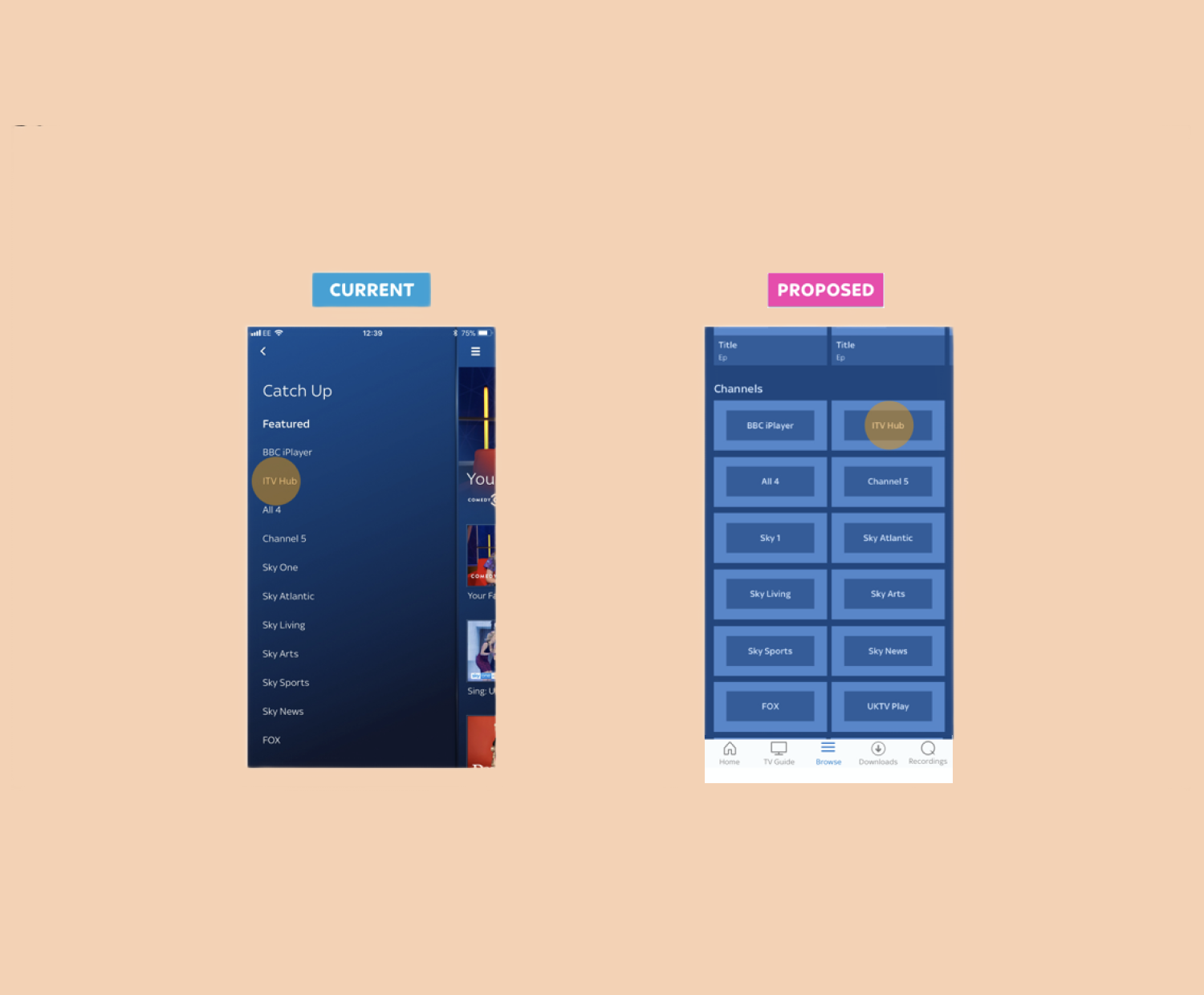
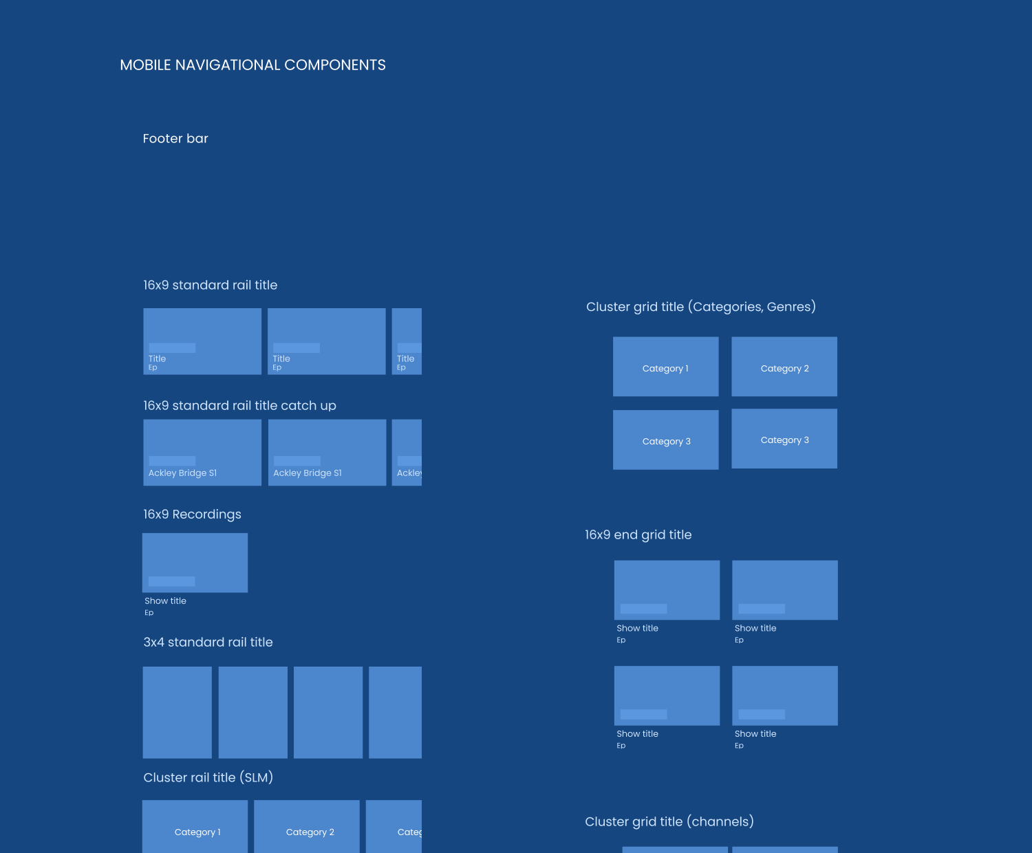
Final UI
Supporting the main UI designer, ensuring that the User Experience principles are consistently adhered to throughout the design process.

