Making Farfetch a Personalised experience
About
Farfetch is a renowned e-commerce company that specialises in offering a wide array of luxury clothing and beauty products through its innovative digital platform. Serving as a vast marketplace, Farfetch showcases a diverse selection of items sourced from numerous prestigious brands, boutiques, and department stores worldwide.
Year · 2016
Job Title · Designer
Company · Farfetch
Year · 2016 Job Title · Designer Company · Farfetch
The Challenge
One strategic theme of Farfetch was personalisation as they knew this increases conversion. One big issue was on mobile as the sign in button was behind a hamburger menu with a low click through rate.
Design Process
Identifying Opportunities
As personalisation touches on different parts of the Farfetch website, I began to identify key areas that we can start to look at and what type of personalisation each area can have.
Creating a personalised area on Farfetch plays a crucial role in boosting conversions and ensuring continuous user engagement. By offering a space where users can stay logged in, the platform can provide a seamless browsing experience. This feature not only saves users' selected items in their baskets but also contributes to making their journey more meaningful and convenient.
Communicating the Design
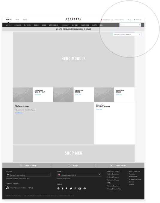
As my UX touched on a complete journey, this helped me communicate which parts of the website users might see personalisation. As development teams are based in Portugal, this made it easier when handing over work.
Modular system
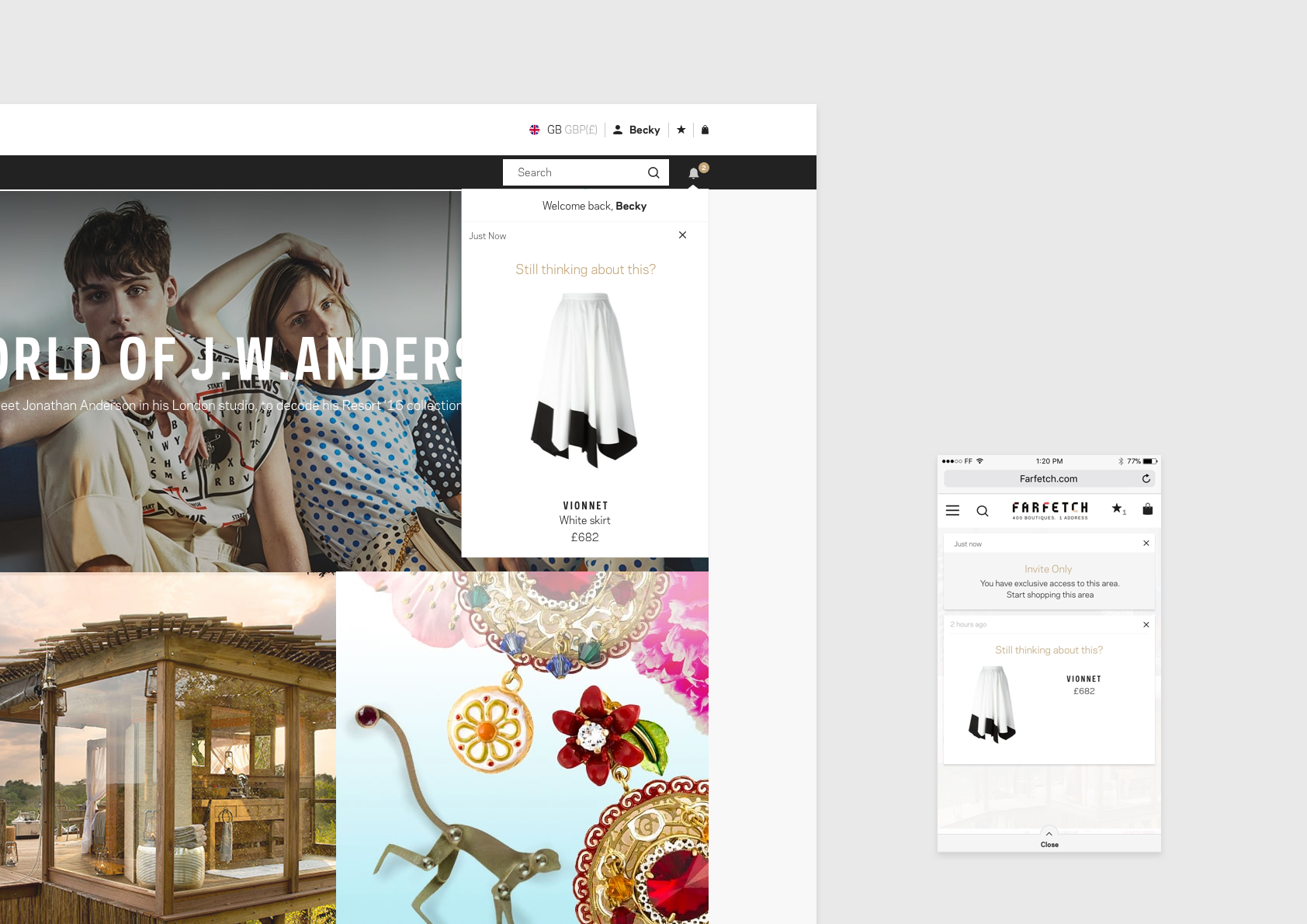
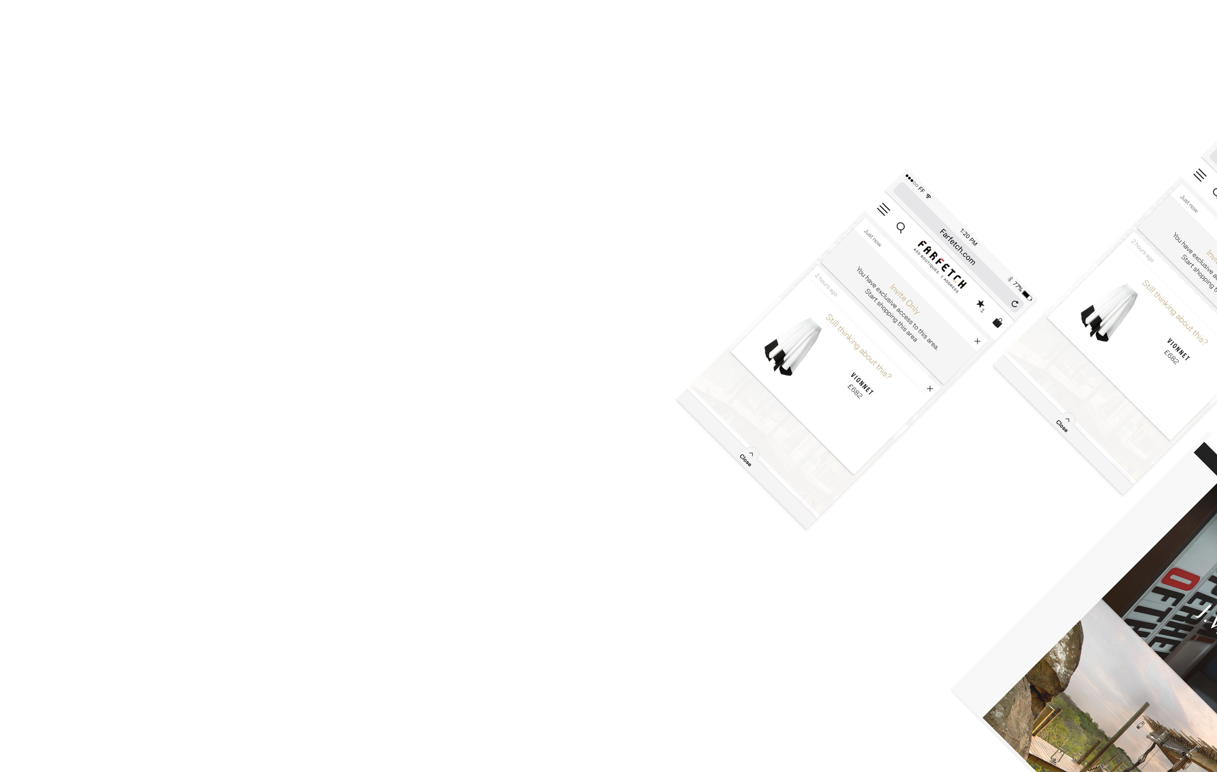
I created a flexible modular system that can be used at various points in the user journey adapting to the scenario. The user might be returning within a couple of days and we have stored their details or they may never have logged into Farfetch before.
Final UI


